Hello community,
we are facing with a strange behavior of adaptive markup in case of its rendering for mobile devices. While for desktops a table is displayed as expected (lhs of the screenshot below), on mobile its structure isn't displayed properly (rhs of the screenshot).
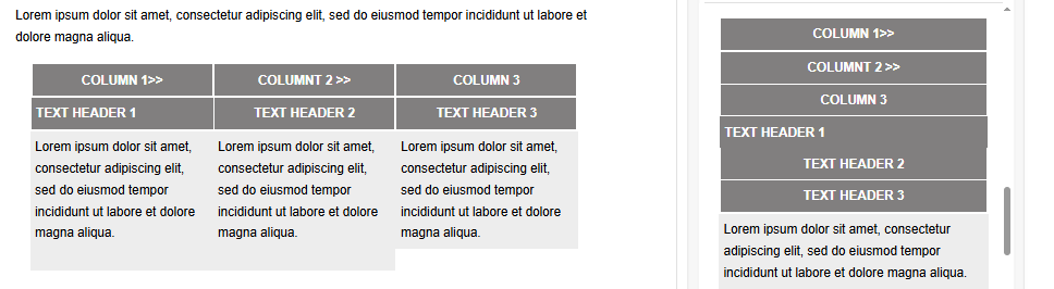
What should we do to prevent this behavior?
Like
Hello,
The adaptive markup automatically stacks row content vertically on mobile devices to optimize layout, improve scrolling, and enhance readability. This is why the table displays differently on mobile compared to desktop.
If you need the row to preserve its horizontal structure on mobile, you can disable the Stack on mobile option in the row properties panel. This setting is on by default and should be toggled only when the design requires maintaining the desktop layout on smaller screens.
Dymytriy Vykhodets,
Hello, could you please upload the screenshot again, becaues it is unavailbale now
Artem Evdokimenko,
Re-attaching it. Please clear your browser cache if you cannot see this image.
Thank you!