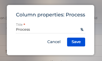
It would be a very useful feature for both developers and users in list views to be able to see the underlying field name (and path to the field, in cases of forwards references) of a column. Currently, for regular columns (not aggregations) you can only see the current name of the column as set up by the developer or the user, if they've customised the name. But this hides information about where that value is actually coming from, making it harder to understand the origin of the data, for example if the user wanted to set up folder filters where they would have to be using the field names in the actual object configuration.
At the moment, this is the only information visible to users for a basic list column's properties, which could have been renamed by either a developer or the user themselves:
Currently, as a developer I need to check in the dev tools' network tab to get the column name and path in the request, then check the object's configuration to find what that field is captioned with. Or check in the page's code to find the configuration that was set up. Neither of these are very user friendly.
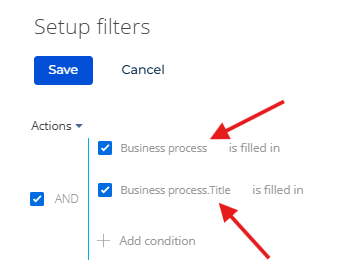
Ideally, the properties popup would be enriched with information about the origin of the data similar to what you would see when setting up a dynamic folder as can be seen here:
![]()