Время создания
Filters

One of my current projects has a complex and tangled package hierarchy. That made me ask myself: if I were designing a new application on the platform from scratch, which approach would I choose?

I'm a big fan of DDD, so I started thinking about how to split schemas so that each package represents an architectural layer of the application, while still keeping development convenient for both no-code and hard-code developers.

A simple split by schema type doesn't work: objects, pages and business processes can depend on each other cyclically. So some schemas have to be split or partially duplicated across packages to keep the hierarchy acyclic. Source code could, of course, be made fully independent of everything else, but that doesn't guarantee stability: code often depends on system settings and populated lookups. Isolating it completely at the very bottom of the hierarchy didn't seem like the best idea either.

I won't walk you through my whole thought process, so let's get straight to the point. The architecture below is my personal preference. I don't claim it's the only right answer (otherwise there would be no question mark in the title). It's the result of my reasoning, my experience, and the pain I'd like to minimize when a release with critical bugs has to be rolled back, without breaking the overall CI/CD approach.

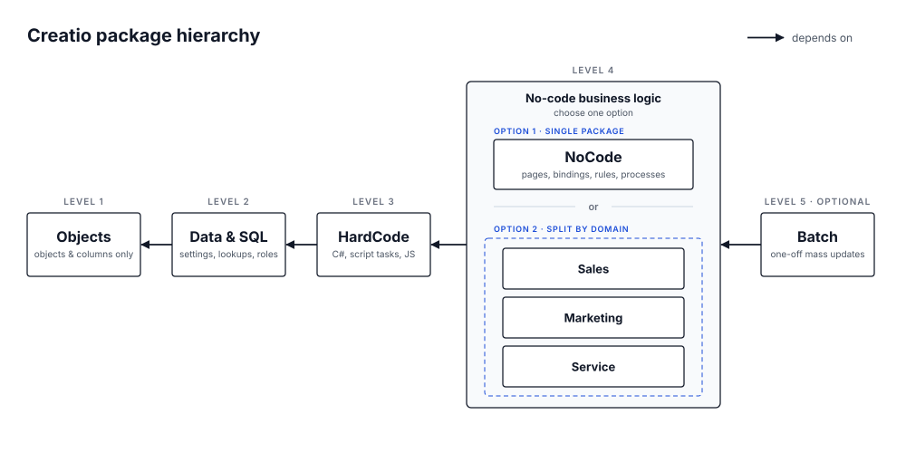
The diagram shows the overall structure. Below I go through it level by level, top to bottom, and explain each decision.

Level 1 — Data model
The package that all packages below depend on. It contains only objects and their columns, and nothing else: no filters, no default values, no required flags.
Why:
• Rollback. If a critical bug reaches production but users have already filled in new columns or tables, we can roll back the business logic (processes, pages) without losing their data.
• Ownership. This package can be entrusted to a more experienced analyst who won't create columns only to delete them later, who pays attention to the data model and takes responsibility for it. New analysts often struggle here, and the data model ends up cluttered with junk columns and objects with default names.

Level 2 — Data and SQL
Data bindings and SQL scripts: system settings, lookup values, roles, SQL scripts. It sits at level 2 because it depends only on the database structure (Level 1), while business processes, source code and column default values depend on it.
A separate data package also lets you quickly move data from dev/test to production when new lookup values are needed. Or the other way around: if someone created roles or lookup values directly on production, by accident or on purpose, you can bring them back to dev without breaking data integrity. Yes, that happens too. Rarely, but it does.

Level 3 — Source code
Business processes with script tasks, user tasks, source code, Angular components, JS modules. All of this essentially depends only on data and the database structure.
Why:
• Hard-code developers get a simpler workflow: the whole project's code can be compiled locally into a single DLL.
• On deployment we know exactly which package to compile to apply the new code. When source code is scattered across several packages, you either have to guess where a schema lives or compile the entire system, which simply takes longer.

Level 4 — No-code business logic
There are two options, depending on the size of your project.
Option 1: a single package containing object replacements (no new columns) with column business rules and default values, pages and their bindings, business processes without script tasks, add-ons, cases, marketing campaigns and no-code web services. This is the analyst's main workspace, where all no-code business logic lives. It depends on all three packages above and acts as an interface layer: business rules and processes only invoke the source code and define how everything is connected.
Page bindings live here, next to the pages they point to, rather than in the data package. A binding depends on its page, so keeping them together means that rolling back this level never leaves bindings pointing to pages that no longer exist.
Option 2: the same idea, split into several packages by domain or application area, for example Sales, Marketing, Service, CRM. Each package has the same internal structure as in option 1, but contains only the logic for its part of the application, or overrides a specific part of the base platform.

Level 5 — Batch processes (optional)
The last, optional level for one-off batch processes used for mass data updates when needed.

Scaling to large projects
Of course, on a very large project you may end up with packages that contain a lot of schemas. But that is the natural outcome of practically any architecture. Nothing stops you from applying this approach several times: if your project consists of several applications, each of them can have its own hierarchy built the same way.

If you've read this far, you probably care about clean architecture on the platform as much as I do. So please leave a comment: challenge it, criticize it. As I said, I don't claim to have the final answer, and I'd genuinely like to hear other perspectives and think about what I could improve. Thanks!

Like 0

Like

Share

0 comments
Show all comments
Service_Creatio_enterprise_edition
8.0

Hello,

I have been searching through the Creatio Academy website for information regarding the integration of user groups with Active Directory (Entra ID).

We currently have an AD integration configured, and it synchronizes individual users while populating selected user information. My question is whether it is possible to integrate entire user groups from AD as well.

For example, we have a group called "Technical Department" that contains five users. As I understand it, the current integration imports those five users into Creatio, but it does not create the "Technical Department" group itself.

Is it possible to synchronize user groups so that the groups themselves are also transferred to Creatio and remain synchronized with Active Directory (or Entra ID)? In other words, if I add or remove a user from the "Technical Department" group in AD, would the corresponding group in Creatio automatically reflect those changes?

I am asking because we are considering using the "Assigned Group" field in service cases. We would like to understand whether we need to create and maintain separate groups directly in Creatio, or whether this can be integrated with AD (Entra ID) so that group membership is managed in a single place and automatically synchronized with Creatio.

Thank you in advance for your help.


Like 0

Like

0 comments
Show all comments
nocode
RealEstateTech
FreedomUI
New_in_Syntech

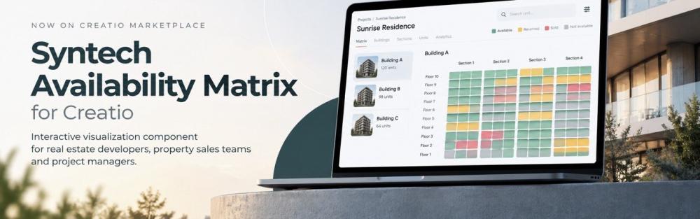
We're excited to introduce Syntech Availability Matrix for Creatio, a new interactive visualization component designed for real estate developers, property sales teams, and project managers.

Managing property inventory becomes easier when buildings, sections, floors, and individual units are presented in one clear visual structure.

With Syntech Availability Matrix, teams can explore project inventory and unit availability directly within Creatio.

Key Features

Availability Matrix Unit Layout

Display apartments, offices, and other properties as color-coded tiles for quick status identification and navigation.

Interactive Building Visualization

Visualize residential and commercial projects with units organized by floors and sections.

Flexible No-Code Configuration

Configure the component without coding to visualize virtually any existing data model in Creatio.

Technical Details

  • UI Framework: Freedom UI
  • Compatibility: Creatio 8.3.4 and later
  • Type: Component
  • Availability: Paid, available on Creatio Marketplace

Syntech Availability Matrix helps make complex real estate inventory easier to navigate and understand, all within your existing Creatio environment.

Explore the component on Creatio Marketplace: https://marketplace.creatio.com/app/syntech-availability-matrix-creatio

We'd love to hear your feedback!

Like 1

Like

Share

0 comments
Show all comments

Hello,

I'm experiencing an unusual issue with the Creatio mobile app.

When I log in using an employee account, the application opens with the Freedom UI home page as expected.

However, when I log in using an external account, the starting page is displayed in the Classic UI. Interestingly, when I navigate to modules, the Cases module is still displayed in Freedom UI.

I would like both views to use Freedom UI.

Could you help me with fixing that behavior? 

088baee1-fd0a-42d4-b8a3-35dc62113b7d 1.jpegEmployee view of home page

85f6d6a8-b3d0-478f-94e0-6fcbc320ae1e 1.jpeg

External view of home page 
 

Otwórz zdjęcie

External view of "Case" module


Like 0

Like

0 comments
Show all comments
How_to_Add_a_Legend_to_a_Doughnut_Chart_in_Creatio_Freedom_UI_Using_JavaScript?
Studio_Creatio_enterprise_edition
8.0

How to Add a Legend to a Doughnut Chart in Creatio Freedom UI Using JavaScript?

Hi Creatio Community,

I'm working on a doughnut chart in Creatio Freedom UI and would like to display a legend below the chart. However, the chart configuration available in the Freedom UI designer does not provide an option to enable the legend for a doughnut chart.

I would like to explore whether this can be achieved through a client-side JavaScript handler without modifying the underlying chart configuration or affecting the chart's existing functionality.

  • Chart element: HTML inside the ts-chart component
  • Requirement: Display a custom legend below the doughnut chart, showing each series' actual color and label.

Questions:

  1. Is there a supported way to enable or configure a legend for a doughnut chart in Creatio Freedom UI?
  2. If the designer does not support this option, can a custom legend be added using a Freedom UI client-side JavaScript handler?
  3. How can we access the chart's actual labels, dataset values, and colors from the ts-chart component or its underlying chart configuration?
  4. Is there a recommended or supported API for accessing the chart instance without relying on undocumented internal properties?

My preference is to display the legend below the doughnut chart, using the existing chart labels and colors, while keeping the implementation scoped to this widget and preserving its existing interactions.

Any guidance, examples, or recommended approaches would be appreciated.

Thank you!

Like 0

Like

1 comments

Hi,

Thank you for the detailed question. Here are answers to each point, followed by the approach we recommend.

1. Is there a supported way to enable a legend for a doughnut chart?

Unfortunately, no. This is a current platform limitation, not a setting the Freedom UI Designer is missing.

  • The Show legend option is available only for Spline, Line, Bar, Area, Column and Scatter charts. Pie and doughnut charts don’t support a legend.
  • If you add a legend setting to the doughnut series by editing the page schema, the page saves it, but no legend appears. The chart turns off the legend for pie, doughnut, funnel and waterfall charts.
  • You can’t set slice colors either. The series color property is ignored for doughnut charts, and slices take their colors from the built-in palette.

What doughnut charts do show is a “label – NN%” data label next to each slice by default. Long labels wrap. Labels that would overlap are hidden, so very small slices may have no label. The dataLabel.display setting has no effect on doughnut charts.

2. Can a custom legend be added with client-side code?

Yes, as a separate element placed directly under the chart. It can’t be drawn inside the chart, because the chart is a single <canvas> with no extension point for that. This approach leaves the chart widget unchanged, so drilldown, tooltips, data labels and keyboard navigation keep working.

3. How can I get the chart’s labels, values and colors?

Labels and values. When a chart series gets its data through the standard data source (data.providing), the platform creates a page attribute named <ChartElementName>_SeriesData. For example, a chart element named MyDoughnut gets MyDoughnut_SeriesData. The attribute holds one array per series, and each item looks like this:

{
  grouping:    { value, displayValue }, // displayValue is the slice label
  aggregation: { value }                // value is the slice value
}


Please keep in mind:

  • The platform generates this attribute and it isn’t part of the documented API, so it may change in future versions.
  • It’s created only when the chart element has no explicit seriesData binding.
  • It’s filled asynchronously, so await it. It holds empty arrays until the data has loaded.

Colors. No API returns the colors the chart draws. Doughnut slices take colors from the built-in palette by slice index, starting again after the last color:

#0058EF, #F9307F, #08857E, #F86700, #4F43C2, #20A959, #009DE3, #FF4013, #B87CCF, #22AC14,
#247EE5, #FF602E, #9641A9, #0B6A32, #E00022, #1566B9, #BE1B5A, #7848EE, #0D2E4E


A legend that uses this list matches the chart today. The palette is an internal detail, though, so check the legend after upgrades.

Order. If the chart has a sort order (seriesOrder), sort your legend items the same way before assigning colors. Otherwise the colors won’t match the slices.

4. Is there a supported API to get the chart instance?

No. @creatio-devkit/common has no API that returns a page element’s component or the underlying Chart.js instance. The chart widget exposes only its configuration inputs, and clicks on the chart are handled inside the widget without reaching the page.

Reading the Chart.js instance from the component or the DOM depends on internal details, and we don’t recommend it. Chart.getChart(canvas) usually doesn’t work from custom code anyway. Custom code loads its own copy of Chart.js, which doesn’t know about the chart the widget created.

Recommended approach

Add a legend element under the chart and leave the chart widget as it is. There are three options, from simplest to most flexible.

Option 1. Text legend with a label (no custom component)

Add a crt.Label under the chart and fill it from a handler:

viewConfigDiff: /**SCHEMA_VIEW_CONFIG_DIFF*/[
  {
    "operation": "insert",
    "name": "MyDoughnutLegend",
    "values": {
      "type": "crt.Label",
      "caption": "$MyDoughnutLegendText",
      "labelType": "body",
      "visible": true
    },
    "parentName": "<container that holds MyDoughnut>",
    "propertyName": "items",
    "index": 1
  }
]/**SCHEMA_VIEW_CONFIG_DIFF*/,
viewModelConfigDiff: /**SCHEMA_VIEW_MODEL_CONFIG_DIFF*/[
  {
    "operation": "merge",
    "path": ["attributes"],
    "values": {
      "MyDoughnutLegendText": {}
    }
  }
]/**SCHEMA_VIEW_MODEL_CONFIG_DIFF*/,
handlers: /**SCHEMA_HANDLERS*/[
  {
    request: "crt.HandleViewModelAttributeChangeRequest",
    handler: async (request, next) => {
      if (request.attributeName === "MyDoughnut_SeriesData") {
        const seriesData = await request.$context.MyDoughnut_SeriesData;
        const items = seriesData?.[0] ?? [];
        request.$context.MyDoughnutLegendText = items
          .map(item => `${item.grouping.displayValue}: ${item.aggregation.value}`)
          .join("  |  ");
      }
      return next?.handle(request);
    }
  }
]/**SCHEMA_HANDLERS*/,


This option can’t show colored markers. Please check on your Creatio version that the change request fires for the generated attribute.

Option 2. Legend with colored markers (custom view element)

Create a small Angular component in a remote module (see “Develop a custom UI component using remote module” on Creatio Academy):

import { Component, Input, ViewEncapsulation } from '@angular/core';
import { CrtInput, CrtViewElement } from '@creatio-devkit/common';

const PALETTE = [
  '#0058EF', '#F9307F', '#08857E', '#F86700', '#4F43C2', '#20A959', '#009DE3',
  '#FF4013', '#B87CCF', '#22AC14', '#247EE5', '#FF602E', '#9641A9', '#0B6A32',
  '#E00022', '#1566B9', '#BE1B5A', '#7848EE', '#0D2E4E'
];

interface LegendItem {
  label: string;
  value: unknown;
}

@Component({
  selector: 'usr-chart-legend',
  template: `
    <div class="usr-legend">
      <span *ngFor="let item of legend; let i = index" class="usr-legend-item">
        <i [style.background]="color(i)"></i>{{ item.label }} ({{ item.value }})
      </span>
    </div>`,
  styles: [`
    .usr-legend { display: flex; flex-wrap: wrap; gap: 8px 16px; justify-content: center; }
    .usr-legend-item { display: inline-flex; align-items: center; }
    .usr-legend-item i { width: 10px; height: 10px; border-radius: 50%; margin-right: 6px; }
  `],
  encapsulation: ViewEncapsulation.Emulated
})
@CrtViewElement({
  selector: 'usr-chart-legend',
  type: 'usr.ChartLegend'
})
export class UsrChartLegendComponent {
  public legend: LegendItem[] = [];

  @Input()
  @CrtInput()
  public set items(value: any) {
    Promise.resolve(value).then(data => {
      this.legend = (data?.[0] ?? []).map((item: any) => ({
        label: item.grouping?.displayValue,
        value: item.aggregation?.value
      }));
    });
  }

  public color(index: number): string {
    return PALETTE[index % PALETTE.length];
  }
}


Register the component in the remote module the standard way. Then place it under the chart on the Freedom UI page:

{
  "operation": "insert",
  "name": "MyDoughnutLegend",
  "values": {
    "type": "usr.ChartLegend",
    "items": "$MyDoughnut_SeriesData"
  },
  "parentName": "<container that holds MyDoughnut>",
  "propertyName": "items",
  "index": 1
}


Option 3. Load the legend data yourself (fully supported API)

If you don’t want to depend on the generated _SeriesData attribute, load the same aggregated data with sdk.Model. Pass the result to the label from Option 1 or the component from Option 2:

const model = await sdk.Model.create("Account");
const rows = await model.load({
  attributes: [
    { name: "Industry", path: "Industry" },
    {
      name: "Count",
      path: "Id",
      type: "function",
      functionConfig: {
        type: "aggregation",
        aggregation: "Count",
        aggregationEval: "all"
      }
    }
  ],
  parameters: [
    /* the same filters the chart uses */
  ]
});


Use the same grouping column, filters and sort order as the chart so the legend rows match the slices.

Limitations

  • A custom legend doesn’t react to the chart’s interactive state, such as a hovered or drilled-down slice.
  • The color palette and the <ChartElementName>_SeriesData attribute are internal details that may change in future versions. Please check the legend after upgrades.

Registering the idea

We agree that a built-in legend for pie and doughnut charts would be useful, and adding one needs a platform change. Please send this idea to support@creatio.com so it’s registered with the R&D team and considered for the product roadmap. Including your use case, such as “legend below the doughnut chart with series colors and labels”, will help us prioritize it.

Show all comments