The problem every Creatio Cloud admin knows
If you administer Creatio Cloud, you've hit this wall. You need to answer a data question — find users created last week who haven't logged in, verify records after a migration, audit which entities were modified during a specific window, or debug why a process instance behaved unexpectedly. In an on-premise setup, you'd write a quick SQL query. On Cloud, you don't have direct database access.
So the question that should take thirty seconds becomes a support ticket, a UI reconstruction exercise, or a CSV export into Excel. None of these scale, and every Creatio team I've worked with absorbs this cost silently, week after week.
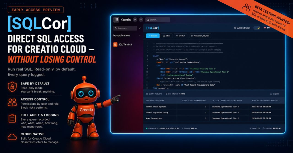
I built SQL Cor to close that gap — without throwing away the safety that made Cloud abstract the database in the first place.
What SQL Cor is
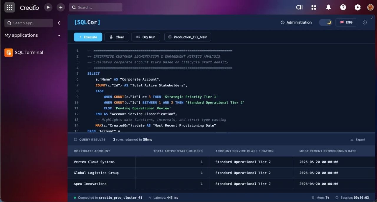
SQL Cor is a Creatio application that adds a controlled SQL terminal directly inside your environment. It's installed as a standard package and runs on both Cloud and on-premise, against PostgreSQL or MSSQL.
The design principle is simple: give admins direct query access, but make every layer of it controlled and auditable.
How access control works
This is the part that matters most, so I'll be specific.
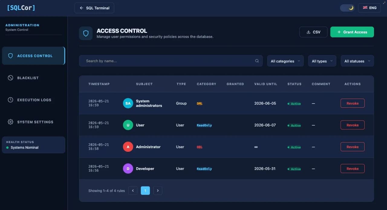
Permission levels are graded per user. Each authorized user is assigned one of three levels:
- Read-only — SELECT queries only. This covers the overwhelming majority of day-to-day operational questions.
- DML — INSERT, UPDATE, DELETE. For users who need to fix data, not just read it.
- DDL — schema-level operations. Granted rarely and deliberately.
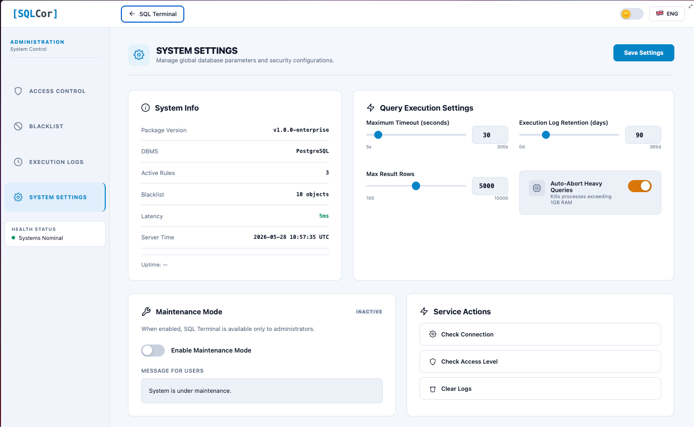
A query blacklist operates above roles. You can block patterns system-wide, regardless of a user's permission level. For example, you can block all DROP TABLE operations entirely, so even a DDL-level user cannot execute them. Blacklist rules can be defined by pattern or by category.
Safe defaults protect the environment. SELECT queries get automatic row-limit injection so a careless query can't pull millions of rows and strain the server. Timeouts are configurable. There's a dry-run mode that previews which rows a DML operation would affect before you actually run it.
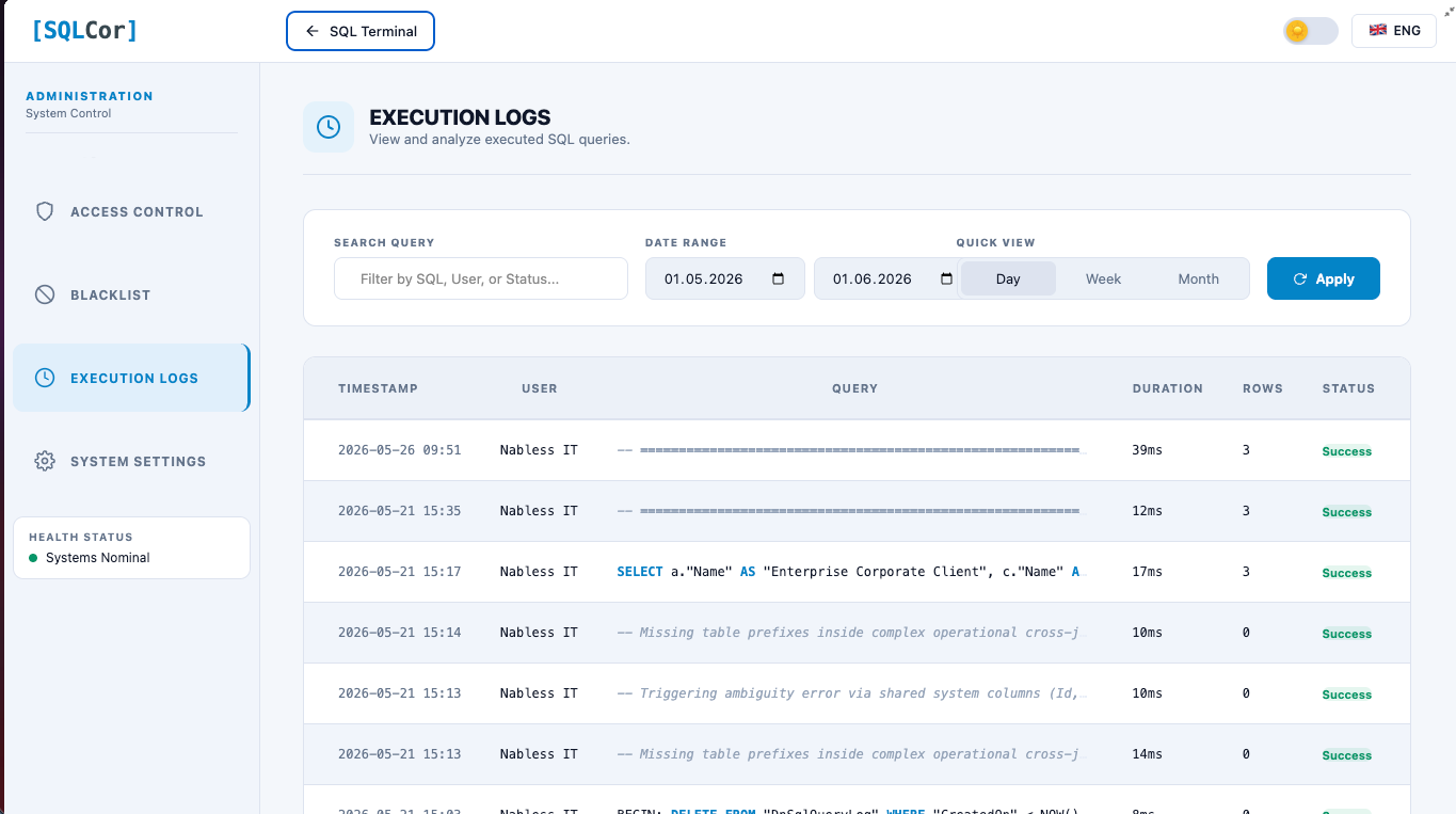
The audit log
Every query that runs through SQL Cor is logged: the user who ran it, the timestamp, the query text, the result summary, and the execution time.
This is the piece that makes direct database access defensible in environments where traceability matters. You're not giving up the audit trail to gain query access — you keep both. In a compliance-sensitive setup, being able to answer "who ran what against the database, and when" is not a nice-to-have. It's a requirement.
Why it's built this way
The interesting realization while building SQL Cor was that the value isn't the SQL terminal itself. Tools like pgAdmin and SSMS have existed for years. The value is controlled access in an environment that deliberately removed it.
Both sides of the tension are legitimate. Creatio Cloud abstracts the database for good reasons — safety, stability, separation of concerns. But admins still have a real, recurring need to query data directly. SQL Cor resolves that tension instead of ignoring either side: the access is real, but it's graded, gated, and logged.
There's also a quieter benefit. When the cost of asking a data question drops to near zero, people ask more questions — and the quality of their work goes up. When every question costs a two-day ticket, teams ration questions without realizing it. That rationing has a hidden cost nobody measures.
Feature summary
- Direct SQL execution against the Creatio database (PostgreSQL or MSSQL)
- Graded access control — Read-only / DML / DDL, assigned per user
- Query blacklist — block dangerous patterns system-wide, regardless of role
- Full audit log — every query logged with user, timestamp, result, execution time
- Safe defaults — automatic row-limit injection on SELECTs, configurable timeouts
- Dry-run mode — preview affected rows before running a DML statement
- Dark / light themes, English and Ukrainian
- Administration page for managing access rules, blacklist entries, and viewing logs
- Installs as a standard Creatio package — self-contained, no external dependencies
- Works on Creatio Cloud and on-premise
Current status
SQL Cor is currently in an open testing period. The build is stable and in active use. Over the testing period I'm focusing on:
- Expanding the pre-defined blacklist categories
- Refining the audit log export
- A saved-query library for common admin tasks
- Per-environment configuration profiles for agencies managing multiple clients
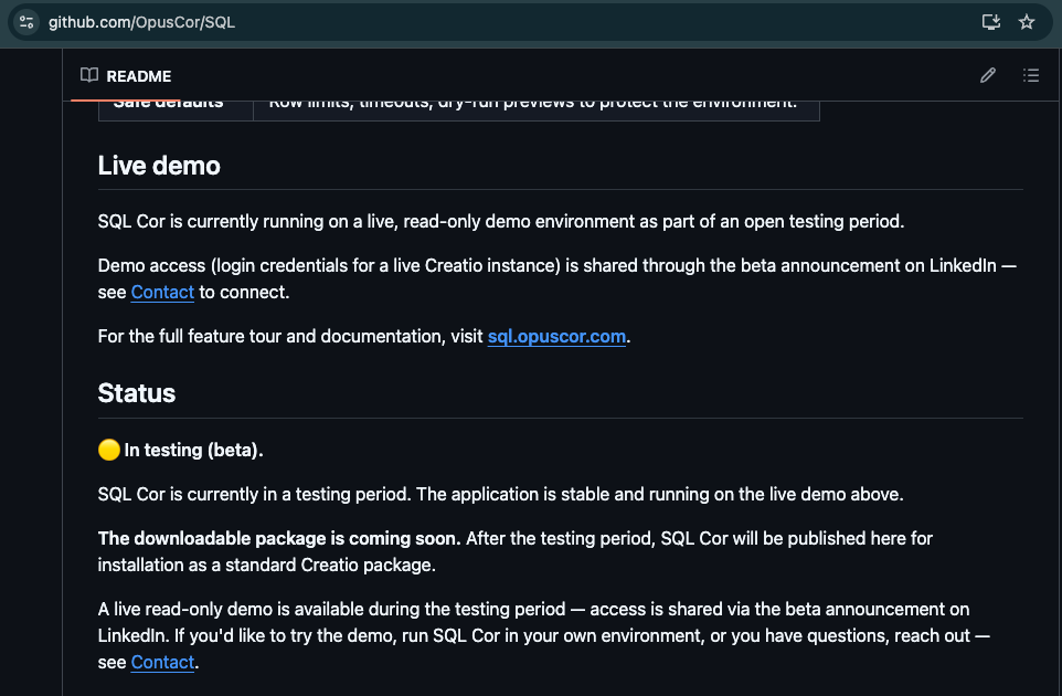
After the testing period, SQL Cor will be published for download and installation as a standard Creatio package.
Getting started
Documentation & installation guide: 👉 sql.opuscor.com — full feature reference, user guide, admin guide, and installation instructions
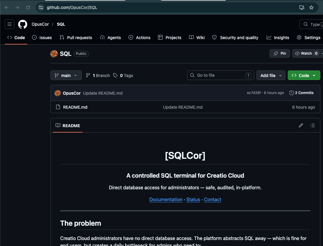
Source code (coming soon after testing period): 👉 github.com/OpusCor/SQL — public repository where the package will be available for download and installation
Live demo access: Currently in open testing. Demo credentials are shared via LinkedIn — visit linkedin.com/in/koliada-artem and check the beta announcement post for access to a live Creatio environment where you can run actual SQL Cor queries.
Feedback welcome
This is a tool built by someone who runs Creatio, for people who run Creatio. If you administer Creatio Cloud and have hit the no-database-access wall, I'd genuinely like to hear how you currently handle it — tickets to the vendor, dashboards for everything, exports to BI tools, or something else.
And if the access-control model, the audit approach, or any feature here sparks a question or a "you should also handle X" — that's exactly the kind of feedback that makes the testing period worth running. Reply here in the Community, and let's talk.
