WCAG detailed guide for more complex customizations

This is a much more detailed guide compared to WCAG guide for no-code creators on all other criteria except colors.

It contains more criteria and technical information for more complex customizations, such as writing custom code or custom UI components for Freedom UI pages.

It's a part of the WCAG user guides. This is a preliminary version to get more feedback about it and later publish it on the Creatio Academy.

Contents:

  • How to use
  • Automatic checks
  • Rules
    1. Component level
      1.1. General recommendations
      1.2. All components criteria
      1.3. Specific components criteria
    2. Page level
  • Courses and articles

How to use

  1. Understand the set of criteria you need to consider.

    1. Different levels of rules (component, page, application) depend on the part of the application that is affected by the task.

    2. Some rules for components apply only to tasks with specific functionality (like images or multi-language content).

  2. Ensure that the developed functionality meets each criterion:

    1. Read the information in this article and the linked WCAG article to get a basic understanding of the criterion.

    2. Get more details by looking at additional material at the end of this article

    3. To verify whether the criteria are met, consider using ESLint and Axe (in Chrome DevTools or Storybook, for example) where applicable. See the “Automatic checks” section below.

⚠️Provided examples and recommendations are intended to give an initial understanding of each rule and don’t cover all scenarios. It is essential to dive deeper into every rule to be able to apply it properly.

Automatic checks

Some rules are partially covered by different types of automatic checks.

⚠️Automatic checks may be useful for finding accessibility issues, but passing all these checks doesn’t ensure that there are no violations. Check functionality manually to ensure compliance.

Rules

1. Component level

Must be applied when:

  • a new component is created from scratch

  • an existing component is changed

1.1. General recommendations

These recommendations should be considered in the early stages of component development.


Recommendations


Related criteria


Violation examples


Read the documentation of the component you are using and Patterns page on the official W3C site

All

Chips component documentation has the Angular Material Chips | Accessibility section. It states: “Always apply MatChipRemove to a button element, never a mat-icon element.”

Yet, the initial chips implementation does not have a button element and uses a mat-icon. It leads to issues with the keyboard, focus, and roles.

To provide more data about the page structure:

  • Use native HTML elements when possible (table for tabular data, button for buttons, a for links, etc.) or valid Creatio elements (like crt-button that has button inside of it)

  • Use label elements to associate text labels with form controls

1.3.1 Info and Relationships

4.1.2 Name, Role, Value

  • A text input with a visible label, but without an accessible name:

  • mat-icon element with no role and proper handlers acts as a button

Ensure that the order of the content in the source code sections matches the visual presentation of the content.

1.3.2 Meaningful Sequence

2.4.3 Focus Order

  • CSS is used to reposition the element in a way that changes the reading order.

  • Ensure all component functionality is available using the keyboard.

  • Ensure scrollable elements or their descendants can be reached with sequential focus navigation so that they can be scrolled by the keyboard.

2.1.1 Keyboard

  • Handling the mouse-over event without the ability to display content on the keyboard focus.

  • Scrollable container with non-focusable content.

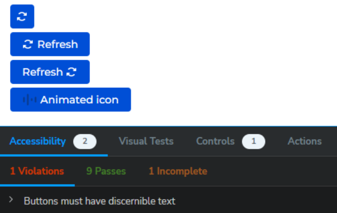
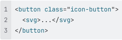
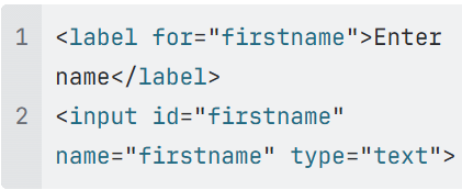
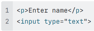
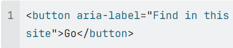
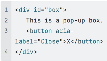
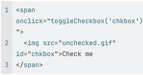
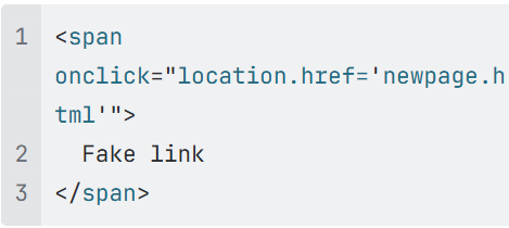
Ensure that every interactive UI element (e.g. links, buttons, controls for custom widgets, form inputs/elements) has an accessible name.

ℹ️The name can come from the native text of the element (e.g. link text, button text), the aria-label text, the text referred to via the aria-labelledby attribute, or other attributes, such as title (depending on context).

4.1.2 Name, Role, Value

  • Button without an accessible name:


1.2. All components criteria

All these criteria should be checked while developing a custom component.


WCAG Criteria


Short guideline


Good/bad examples


Automatic checks


1.3.1 Info and Relationships

  • Elements MUST be used according to their meaning, not because of the way they appear visually. Use native HTML whenever possible and according to the W3C specifications.

    • Tables:

      • Tabular data SHOULD be represented in a table.

      • Table data cells MUST be explicitly associated with header cells for data tables, and descriptive table captions and summaries MAY be provided where appropriate.

    • Headings:

      • Text that does not act as a heading visually or structurally MUST NOT be marked as a heading.

      • Headings MUST be marked up using real HTML heading elements.

    • Lists MUST be constructed using the appropriate semantic markup (i.e. ul or ol with li child elements, or dl with dt and dd child elements).

  • Labels MUST be programmatically associated with form input elements, using label (explicit or implicit), title, aria-labelledby or aria-label.

  • A text alternative for informative CSS-generated content MUST be provided, AND the CSS-generated text SHOULD be set to aria-hidden="true".

  • Check Mark Input with associated label

  • Cross Mark A text input with a visible label, but without an accessible name:

  • Cross Mark mat-icon element with no role and proper handlers acts as a button

  • Lint (bad)

  • Axe (good)

1.3.2 Meaningful Sequence

  • The reading and navigation order (determined by code order) MUST be logical and intuitive. While it is BEST PRACTICE to make reading order and visual order match (identical), It is NOT a true failure UNLESS meaning is really changed by the order.

  • Dynamically generated content following user interaction MUST meet one of the following: assistive technology is automatically made aware of the new content OR the new content is the very next thing the assistive technology will encounter on the page.

  • ℹ️Silence is bad. When screen reader users activate a feature (link, button, control, etc.), or when an important part of the content changes, they need to hear feedback. One of the basic challenges with dynamic content is to figure out the best way to tell screen reader users about the dynamic changes.

  • Check Mark order of elements in HTML match their visual order

  • Cross Mark content (like snack-bar) is dynamically generated at the end of the page and styled with CSS, but assistive technology is not made aware of it

Cross Mark None

2.1.1 Keyboard

  • Page functionalities MUST be available using the keyboard, unless the functionality cannot be accomplished in any known way using a keyboard.

  • Page-specified shortcut keys and accesskeys MUST NOT conflict with existing browser and screen reader shortcuts.

  • Cross Mark some actions are performed only on mouse click and are not available via the keyboard

  • Lint (good)

  • Axe (bad)

2.1.2 No Keyboard Trap

  • Keyboard focus MUST NOT be locked or trapped in a particular page element and the user MUST be able to navigate to and from all navigable page elements using only a keyboard.

  • Cross Mark after focusing on an element, the user isn’t able to return to content outside

Cross Mark None

2.4.3 Focus Order

  • The navigation order of links, form elements, etc. MUST be logical and intuitive.

  • The order of content in the source code SHOULD be the same as the visual presentation of the content.

  • The focus MUST be purposely moved or set (via JavaScript) onto the appropriate element when the user's action requires a change of context or location for effective keyboard or touch interaction.

  • Modal dialogs:

    • keyboard focus is moved to the newly-opened modal dialog;

    • keyboard focus returns to the invoking element (assuming the element is still on the page) when the modal dialog is closed;

    • keyboard focus is limited (trapped) to the contents of the modal dialog and the browser's chrome (e.g., the browser-specific UI, such as the address bar, etc.);

    • the page's content 'outside' of the modal dialog becomes inert, resulting in the content becoming hidden from assistive technologies, and inoperable to all users, so long as the modal dialog remains open;

    • the use of the Escape key to close the modal dialog.

  • The focus MUST NOT become lost or reset to the top of the page, except when loading or re-loading a page.

  • Check Mark order of elements in HTML match their visual order

  • Check Mark displaying a modal dialog automatically moves focus to the content of this dialog

  • Cross Mark the user is able to move focus outside the modal dialog

  • Cross Mark the tabindex is used to change the focus order

Lint (bad)

2.4.11 Focus Not Obscured (Minimum)

  • When a user interface component receives keyboard focus, the component MUST NOT be entirely hidden due to author-created content.

  • Cross Mark a page has a sticky footer that is tall enough to completely cover the element in focus as a user tabs down the page.

Cross Mark None

2.5.3 Label in Name

  • The visual labels for links, buttons, form elements, and other controls SHOULD match the programmatic labels (to allow easy and intuitive voice commands).

  • For user interface components with labels that include text or images of text, the name MUST contain the text that is presented visually.

  • The programmatic label MUST include the same text presented in the visual label, to facilitate voice activation.

  • Cross Mark the text in a search button reads "Go" but the accessible name provided in an aria-label attribute is "Find in this site"

Axe (bad)

3.2.2 On Input

  • When a user inputs information or interacts with a control, it MUST NOT result in a substantial change to the page, the spawning of a pop-up window, an additional change of keyboard focus, or any other change that could confuse or disorient the user unless the user is informed of the change ahead of time.

  • Cross Mark when the user selects an item in the dropdown, a modal dialog is displayed (without a warning of this behavior in advance)

  • Check Mark a button is used to perform a “change of context” (such as opening a modal dialog)

Cross Mark None

3.3.7 Redundant Entry

  • Information previously entered by or provided to the user that is required to be entered again in the same process MUST be either auto-populated or available for the user to select, with several allowable exceptions.

  • The allowable exceptions when redundant entry may be required are when:

    • re-entering the information is essential,

    • the information is required to ensure the security of the content, or

    • the previously entered information is no longer valid.

  • Check Mark re-entering a password during registration (exception)

  • Cross Mark entering a value in the drop-down control and entering the same value in the selection window for this control

Axe (bad)

4.1.2 Name, Role, Value

The name, role and value of page components MUST be programmatically determinable by assistive technologies.

  • Every interactive UI element (e.g. links, buttons, controls for custom widgets, form inputs/elements) MUST have a name. Note: The name can come from the native text of the element (e.g. link text, button text), a value attribute (e.g. input type="submit" value="Name goes here"), the aria-label text, the text referred to via the

    aria-labelledby ID value, or other attributes, such as title (depending on context).

  • The semantic meaning of elements MUST be communicated via appropriate native HTML element or ARIA role.

    • When an HTML element exists, the HTML element SHOULD be used instead of the equivalent ARIA role, whenever possible.

  • Any dynamic properties — such as whether a checkbox is checked, a tab is selected, or a menu is expanded — MUST be programmatically set and updated. ARIA attributes (like aria-checked or aria-expanded) can be used to reflect these states accurately.

  • Links:

    • Links MUST be semantically designated as such. Ideally this means using an a element with a valid href value. In rare problematic cases, setting role="link" (and adding all other aspects of link functionality) may be acceptable.

    • A link MUST have programmatically discernible text, as determined by the accessible name calculation algorithm.

  • Check Mark using HTML form controls and links (a for links, button for buttons, input for inputs and checkboxes, etc.)

  • Check Mark using aria-label to provide an invisible label where a visible label cannot be used

  • Cross Mark using a script to make div or span a user interface control in HTML without providing a role for the control

  • Cross Mark emulating links with span

  • Lint (good)

  • Axe (good)

4.1.3 Status Messages

  • When the visual and/or functional state of an element changes (e.g. aria-valuenow, aria-pressed, aria-expanded, ariachecked), the ARIA state MUST be changed accordingly.

  • If a state change cannot be communicated via a change in an ARIA attribute, when the state change is the result of a user action or request, the state change MUST be communicated to the user visually AND MUST be communicated to assistive technologies using a technique such as:

    • aria-live announcement

    • ARIA alert (inject text into a pre-existing container with role="alert")

    • Move keyboard focus to the announcement (warning: moving the focus can be disorienting, so should be used with caution)

  • Check Mark a snack-bar notification is shown after completing an operation, aria-live is used for communicating it to assistive technologies

  • Cross Mark when a user searches and no results are found, "0 results returned" is shown below the search bar, but without a proper status role, screen readers won't announce it automatically

Cross Mark None


1.3. Specific components criteria

These criteria may be applied to a specific custom component depending on their functionality or other conditions.

For example, components containing images must also meet criteria 1.1.1 Non-text Content and 1.4.5 Images of Text.


Elements & WCAG criteria


Short guideline


Good/bad examples


Automatic checks

 
  • Images

  • Charts and diagrams

  • Video/audio content

WCAG criteria:
1.1.1 Non-text Content

  • Images MUST have descriptive alternative text (alt attribute value, title attribute value, aria-label property or aria-labelledby property) that serves the same purpose and presents the same information as the linked image.

  • Images that do not convey content, are decorative, or with content that is already conveyed in text MUST be given null alternative text (alt=""), ARIA role="presentation" or implemented as CSS backgrounds.

  • CSS images are either pure decoration or MUST have an aria-label or aria-labelledby on the containing element such as a div, which provides the text alternative.

  • Input type image form fields MUST have a non-empty alt attribute (alt attribute value, title attribute value, aria-label property or aria-labelledby property). Form buttons MUST have a descriptive value. Form inputs MUST have associated text labels or, if labels cannot be used, MUST provide a descriptive title or aria-label attribute.

  • Text alternatives MUST be provided to identify the purpose of the video or audio content.

  • Check Mark using alt attributes on img elements

  • Cross Mark using CSS to include images that convey important information

  • Cross Mark a complex chart is presented without a text alternative or data table for users who can't see it

  • Lint (good)

  • Axe (good)


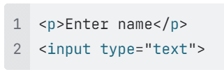
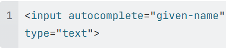
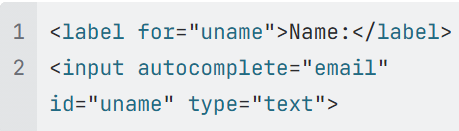
Inputs

WCAG criteria:
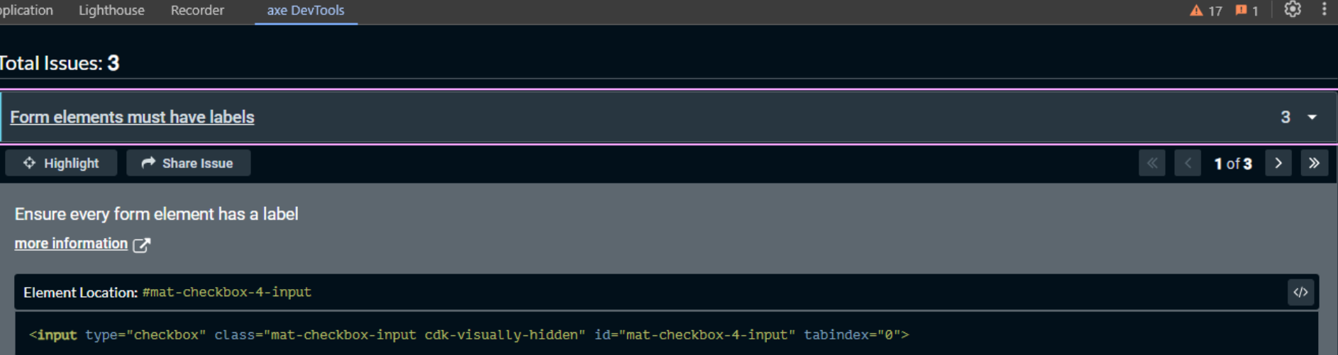
1.3.5 Identify Input Purpose

  • The purpose for each common input field that collects an individual's personal data MUST be programmatically defined based on the list of Input Purposes for User Interface Components (for example, via the type or autocomplete attribute).

Warning In most cases, inputs in Creatio do not collect the personal data of the current user, and their purpose cannot be identified.

  • Check Mark the autocomplete attribute is used to specify the input purpose

  • Cross Mark the incorrect autocomplete attribute value is used

Axe (bad)

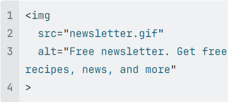
Images

WCAG criteria:
1.4.5 Images of Text

  • If the same visual presentation can be made using text alone, an image MUST NOT be used to present that text.

  • Check Mark CSS is used to display styled text

  • Cross Mark an image is used to display styled text

Cross Mark None

Overlays displayed on hover/focus

WCAG criteria:
1.4.13 Content on Hover or Focus

Where receiving and then removing pointer hover or keyboard focus triggers additional content to become visible and then hidden, the following are true:

  • Dismissible. A mechanism is available to dismiss the additional content without moving pointer hover or keyboard focus, unless the additional content communicates an input error or does not obscure or replace other content;

  • Hoverable. If pointer hover can trigger the additional content, then the pointer can be moved over the additional content without the additional content disappearing;

  • Persistent. The additional content remains visible until the hover or focus trigger is removed, the user dismisses it, or its information is no longer valid.

  • Check Mark a menu appears when an input field is focused, the “Esc” key hides it

  • Cross Mark a help icon shows a tooltip on hover, but it vanishes as soon as the user moves their mouse toward it

  • Cross Mark a tooltip appears on hover but does not show when using keyboard navigation (e.g., Tab key)

Cross Mark None

All elements with keyboard shortcuts

WCAG criteria:
2.1.4 Character Key Shortcuts

  • If a single-character-key shortcut exists, then at least one of the following MUST be true: single-character-key shortcuts can be turned off, remapped, or are only active when the relevant user interface component is in focus.

  • Page-specified shortcut keys and accesskeys MUST NOT conflict with existing keyboard shortcuts in the browser, operating system, or assistive technologies.

  • Cross Mark using the "S" key to send messages without the ability to disable or change it

  • Cross Mark pressing "Enter" anywhere on a form immediately submits it, without ensuring the user intended to do so

Cross Mark None

Auto-refreshable content

WCAG criteria:
2.2.2 Pause, Stop, Hide

  • Automatically moving, blinking, or scrolling content that lasts longer than 5 seconds MUST be able to be paused, stopped, or hidden by the user.

  • Automatically updating content MUST be able to be paused, stopped, or hidden by the user or the user can manually control the timing of the updates.

  • Check Mark a form displays a blinking error message for a couple of seconds, but then it becomes static

  • Cross Mark a chat window continuously updates with new messages but offers no option to pause or stop auto-scrolling

Cross Mark None

All elements with pointer gestures (like sliders)

WCAG criteria:
2.5.1 Pointer Gestures

  • All functionality that uses multipoint or path-based gestures for operation MUST be operable with a single pointer without a path-based gesture, unless a multipoint or path-based gesture is essential.

  • (Touchscreen) Functionality MUST work with a single pointer (e.g. a single finger), unless multipoint activation is essential.

  • (Touchscreen) Functionality MUST be available using screen reader touch methods (e.g. single tap or double tap actions), unless the functionality cannot be accomplished in any known way using a touch device.

  • Check Mark a task management app provides the ability to drag tasks to reorder them, and also there is a way to move items via buttons or keyboard

  • Cross Mark a map feature allows only pinch-to-zoom with no buttons or controls for zooming

Cross Mark None

All elements with pointer handling (like drag&drop)

WCAG criteria:
2.5.2 Pointer Cancellation

  • For functionality that can be operated using a single pointer, at least one of the following MUST be true:

    • No Down-Event. The down-event of the pointer is not used to execute any part of the function;

    • Abort or Undo. Completion of the function is on the up-event, and a mechanism is available to abort the function before completion or to undo the function after completion;

    • Up Reversal. The up-event reverses any outcome of the preceding down-event;

    • Essential. Completing the function on the down-event is essential.

  • (Touchscreen) Touch events MUST NOT be activated on a down event (use up events instead), to allow users to cancel, abort, or undo touch events, unless the down event is essential.

  • Check Mark if a dragged item is dropped outside the target, the drag-n-drop event is canceled

  • Cross Mark a submit button registers the action as soon as it is pressed (mousedown or touchstart), preventing users from changing their minds before releasing

Cross Mark None

All elements (mobile app)

WCAG criteria:
2.5.4 Motion Actuation

  • Functionality that can be operated by device or user motion MUST also be operable by user interface components and MUST allow the ability to disable motion actuation.

  • Cross Mark a gallery app changes layouts when the device is rotated but does not offer a manual toggle

Cross Mark None

Elements with text of language that differs from the page

WCAG criteria:
3.1.2 Language of Parts

  • Inline language changes MUST be identified with a valid lang attribute

  • Check Mark a field displays the value in different languages and specifies the lang attribute for respective elements

Axe (bad)

Elements with manual focus handling

WCAG criteria:
3.2.1 On Focus

  • When a page element receives focus, it MUST NOT result in a substantial change to the page, the spawning of a pop-up window, an additional change of keyboard focus, or any other change that could confuse or disorient the user.

  • Cross Mark a pop-up opens as soon as a user tabs into a field, disrupting navigation

Cross Mark None


2. Page level

Must be applied when:

  • a new Freedom UI page is created from scratch

  • existing Freedom UI page is changed

    • new components are added

    • configuration of existing components is changed

The following component-level criteria should be checked in the context of the page even if all components inside already meet them.


WCAG criteria


Why check on the page?


1.4.5 Images of Text

The component may work with arbitrary images and may not know about the content of the image.

2.1.1 Keyboard

There may be some event handlers or other settings specified on the page, preventing normal keyboard access.

2.2.2 Pause, Stop, Hide

Visual components may not know that the displayed content is auto-refreshable, it may be the page’s responsibility.

2.4.3 Focus Order

Focus order may be acceptable inside every component, but these components may be combined (or configured) in the wrong way.

2.4.11 Focus Not Obscured (Minimum)

Focus may be obscured by different components on the page if they are combined in the wrong way.

3.2.2 On Input

There may be some event handlers specified on the page, triggering the context change.

3.3.7 Redundant Entry

The page may require re-entering the information even though each component on it doesn’t.

4.1.2 Name, Role, Value

In some cases, the necessary attribute may be set to the respective component from the page.

4.1.3 Status Messages

Page may be responsible for visual/function changes and must use components to communicate those changes.


The criteria below should usually be met in the context of a specific page or user flow.


Functionality & WCAG criteria

Short guideline

Good/bad examples

Automatic checks

Use cases with long duration

WCAG criteria:
2.2.1 Timing Adjustable

  • If a page or application has a time limit, the user MUST be given options to turn off, adjust, or extend that time limit.

  • Check Mark displaying a pop-up 1 minute before session expiration that allows users to extend this session

  • Cross Mark forcing the user to complete a form within 5 minutes, without the ability to disable or extend this timeout

Cross Mark None

All pages

WCAG criteria:
2.4.2 Page Titled

  • Pages MUST have descriptive and informative page titles.

  • ℹ️In most cases, the Freedom UI shell sets the title for each opened page.

  • Cross Mark a static title (like “Creatio”) on all pages of the web application

Axe (bad)

All pages

WCAG criteria:
2.4.5 Multiple Ways

  • Multiple ways MUST be available to find other web pages on the site - at least two of: a list of related pages, table of contents, site map, site search, or list of all available web pages.

  • ℹ️For most pages, it's managed by the host (Freedom UI shell), but some pages may require additional efforts.

  • Cross Mark relying exclusively on the navigation menu, without a search bar or other means of locating specific content

Cross Mark None


ℹ️Creatio OOTB covers a number of page-level criteria, for example:

Also, if you set a custom login page (usually done by setting up the SSO 3rd party provider, and want it to be accessible, please check if it supports 3.3.8 Accessible Authentication (Minimum) criterion.

Additional courses and articles

We encourage you to use additional tools, articles, and, especially nowadays, new AI tools to get help with WCAG checks. All major AI chat providers could provide you with a lot of useful answers to WCAG questions.

Articles

  1. Web Content Accessibility Guidelines (WCAG) 2.2 (consider checking the “Techniques” section)

  2. Web Accessibility Checklist by Deque

  3. A short guide for developers covering the most important rules: Accessibility Developers' Guide by Deque

  4. Access Guide - a friendly introduction to accessibility

  5. List of all W3C guidelines: Web Content Accessibility Guidelines (WCAG) 2.2

  6. List of all rules covered by Axe: List of axe 4.10 rules | Deque University | Deque Systems

Courses

Great to start with:

Great to go in-depth:

  • ESDC Self-Paced Web Accessibility Course
    The concepts, success criteria and techniques are thoroughly explained using clear and simple language with relevant examples and sample code.
    There are 11 modules in the course, and it takes about 1 hour of reading per module.
    This course is designed for designers, developers, testers, trainers, content authors, project managers and anyone who's interested in learning more about web accessibility.

Like 1

Like

Share

0 comments
Show all comments