How_to_Add_a_Legend_to_a_Doughnut_Chart_in_Creatio_Freedom_UI_Using_JavaScript?
Studio_Creatio_enterprise_edition
8.0

How to Add a Legend to a Doughnut Chart in Creatio Freedom UI Using JavaScript?

Hi Creatio Community,

I'm working on a doughnut chart in Creatio Freedom UI and would like to display a legend below the chart. However, the chart configuration available in the Freedom UI designer does not provide an option to enable the legend for a doughnut chart.

I would like to explore whether this can be achieved through a client-side JavaScript handler without modifying the underlying chart configuration or affecting the chart's existing functionality.

  • Chart element: HTML inside the ts-chart component
  • Requirement: Display a custom legend below the doughnut chart, showing each series' actual color and label.

Questions:

  1. Is there a supported way to enable or configure a legend for a doughnut chart in Creatio Freedom UI?
  2. If the designer does not support this option, can a custom legend be added using a Freedom UI client-side JavaScript handler?
  3. How can we access the chart's actual labels, dataset values, and colors from the ts-chart component or its underlying chart configuration?
  4. Is there a recommended or supported API for accessing the chart instance without relying on undocumented internal properties?

My preference is to display the legend below the doughnut chart, using the existing chart labels and colors, while keeping the implementation scoped to this widget and preserving its existing interactions.

Any guidance, examples, or recommended approaches would be appreciated.

Thank you!

Like 0

Like

1 comments

Hi,

Thank you for the detailed question. Here are answers to each point, followed by the approach we recommend.

1. Is there a supported way to enable a legend for a doughnut chart?

Unfortunately, no. This is a current platform limitation, not a setting the Freedom UI Designer is missing.

  • The Show legend option is available only for Spline, Line, Bar, Area, Column and Scatter charts. Pie and doughnut charts don’t support a legend.
  • If you add a legend setting to the doughnut series by editing the page schema, the page saves it, but no legend appears. The chart turns off the legend for pie, doughnut, funnel and waterfall charts.
  • You can’t set slice colors either. The series color property is ignored for doughnut charts, and slices take their colors from the built-in palette.

What doughnut charts do show is a “label – NN%” data label next to each slice by default. Long labels wrap. Labels that would overlap are hidden, so very small slices may have no label. The dataLabel.display setting has no effect on doughnut charts.

2. Can a custom legend be added with client-side code?

Yes, as a separate element placed directly under the chart. It can’t be drawn inside the chart, because the chart is a single <canvas> with no extension point for that. This approach leaves the chart widget unchanged, so drilldown, tooltips, data labels and keyboard navigation keep working.

3. How can I get the chart’s labels, values and colors?

Labels and values. When a chart series gets its data through the standard data source (data.providing), the platform creates a page attribute named <ChartElementName>_SeriesData. For example, a chart element named MyDoughnut gets MyDoughnut_SeriesData. The attribute holds one array per series, and each item looks like this:

{
  grouping:    { value, displayValue }, // displayValue is the slice label
  aggregation: { value }                // value is the slice value
}


Please keep in mind:

  • The platform generates this attribute and it isn’t part of the documented API, so it may change in future versions.
  • It’s created only when the chart element has no explicit seriesData binding.
  • It’s filled asynchronously, so await it. It holds empty arrays until the data has loaded.

Colors. No API returns the colors the chart draws. Doughnut slices take colors from the built-in palette by slice index, starting again after the last color:

#0058EF, #F9307F, #08857E, #F86700, #4F43C2, #20A959, #009DE3, #FF4013, #B87CCF, #22AC14,
#247EE5, #FF602E, #9641A9, #0B6A32, #E00022, #1566B9, #BE1B5A, #7848EE, #0D2E4E


A legend that uses this list matches the chart today. The palette is an internal detail, though, so check the legend after upgrades.

Order. If the chart has a sort order (seriesOrder), sort your legend items the same way before assigning colors. Otherwise the colors won’t match the slices.

4. Is there a supported API to get the chart instance?

No. @creatio-devkit/common has no API that returns a page element’s component or the underlying Chart.js instance. The chart widget exposes only its configuration inputs, and clicks on the chart are handled inside the widget without reaching the page.

Reading the Chart.js instance from the component or the DOM depends on internal details, and we don’t recommend it. Chart.getChart(canvas) usually doesn’t work from custom code anyway. Custom code loads its own copy of Chart.js, which doesn’t know about the chart the widget created.

Recommended approach

Add a legend element under the chart and leave the chart widget as it is. There are three options, from simplest to most flexible.

Option 1. Text legend with a label (no custom component)

Add a crt.Label under the chart and fill it from a handler:

viewConfigDiff: /**SCHEMA_VIEW_CONFIG_DIFF*/[
  {
    "operation": "insert",
    "name": "MyDoughnutLegend",
    "values": {
      "type": "crt.Label",
      "caption": "$MyDoughnutLegendText",
      "labelType": "body",
      "visible": true
    },
    "parentName": "<container that holds MyDoughnut>",
    "propertyName": "items",
    "index": 1
  }
]/**SCHEMA_VIEW_CONFIG_DIFF*/,
viewModelConfigDiff: /**SCHEMA_VIEW_MODEL_CONFIG_DIFF*/[
  {
    "operation": "merge",
    "path": ["attributes"],
    "values": {
      "MyDoughnutLegendText": {}
    }
  }
]/**SCHEMA_VIEW_MODEL_CONFIG_DIFF*/,
handlers: /**SCHEMA_HANDLERS*/[
  {
    request: "crt.HandleViewModelAttributeChangeRequest",
    handler: async (request, next) => {
      if (request.attributeName === "MyDoughnut_SeriesData") {
        const seriesData = await request.$context.MyDoughnut_SeriesData;
        const items = seriesData?.[0] ?? [];
        request.$context.MyDoughnutLegendText = items
          .map(item => `${item.grouping.displayValue}: ${item.aggregation.value}`)
          .join("  |  ");
      }
      return next?.handle(request);
    }
  }
]/**SCHEMA_HANDLERS*/,


This option can’t show colored markers. Please check on your Creatio version that the change request fires for the generated attribute.

Option 2. Legend with colored markers (custom view element)

Create a small Angular component in a remote module (see “Develop a custom UI component using remote module” on Creatio Academy):

import { Component, Input, ViewEncapsulation } from '@angular/core';
import { CrtInput, CrtViewElement } from '@creatio-devkit/common';

const PALETTE = [
  '#0058EF', '#F9307F', '#08857E', '#F86700', '#4F43C2', '#20A959', '#009DE3',
  '#FF4013', '#B87CCF', '#22AC14', '#247EE5', '#FF602E', '#9641A9', '#0B6A32',
  '#E00022', '#1566B9', '#BE1B5A', '#7848EE', '#0D2E4E'
];

interface LegendItem {
  label: string;
  value: unknown;
}

@Component({
  selector: 'usr-chart-legend',
  template: `
    <div class="usr-legend">
      <span *ngFor="let item of legend; let i = index" class="usr-legend-item">
        <i [style.background]="color(i)"></i>{{ item.label }} ({{ item.value }})
      </span>
    </div>`,
  styles: [`
    .usr-legend { display: flex; flex-wrap: wrap; gap: 8px 16px; justify-content: center; }
    .usr-legend-item { display: inline-flex; align-items: center; }
    .usr-legend-item i { width: 10px; height: 10px; border-radius: 50%; margin-right: 6px; }
  `],
  encapsulation: ViewEncapsulation.Emulated
})
@CrtViewElement({
  selector: 'usr-chart-legend',
  type: 'usr.ChartLegend'
})
export class UsrChartLegendComponent {
  public legend: LegendItem[] = [];

  @Input()
  @CrtInput()
  public set items(value: any) {
    Promise.resolve(value).then(data => {
      this.legend = (data?.[0] ?? []).map((item: any) => ({
        label: item.grouping?.displayValue,
        value: item.aggregation?.value
      }));
    });
  }

  public color(index: number): string {
    return PALETTE[index % PALETTE.length];
  }
}


Register the component in the remote module the standard way. Then place it under the chart on the Freedom UI page:

{
  "operation": "insert",
  "name": "MyDoughnutLegend",
  "values": {
    "type": "usr.ChartLegend",
    "items": "$MyDoughnut_SeriesData"
  },
  "parentName": "<container that holds MyDoughnut>",
  "propertyName": "items",
  "index": 1
}


Option 3. Load the legend data yourself (fully supported API)

If you don’t want to depend on the generated _SeriesData attribute, load the same aggregated data with sdk.Model. Pass the result to the label from Option 1 or the component from Option 2:

const model = await sdk.Model.create("Account");
const rows = await model.load({
  attributes: [
    { name: "Industry", path: "Industry" },
    {
      name: "Count",
      path: "Id",
      type: "function",
      functionConfig: {
        type: "aggregation",
        aggregation: "Count",
        aggregationEval: "all"
      }
    }
  ],
  parameters: [
    /* the same filters the chart uses */
  ]
});


Use the same grouping column, filters and sort order as the chart so the legend rows match the slices.

Limitations

  • A custom legend doesn’t react to the chart’s interactive state, such as a hovered or drilled-down slice.
  • The color palette and the <ChartElementName>_SeriesData attribute are internal details that may change in future versions. Please check the legend after upgrades.

Registering the idea

We agree that a built-in legend for pie and doughnut charts would be useful, and adding one needs a platform change. Please send this idea to support@creatio.com so it’s registered with the R&D team and considered for the product roadmap. Including your use case, such as “legend below the doughnut chart with series colors and labels”, will help us prioritize it.

Show all comments
Restrict_Global_Search_filter/dropdown_where_users_can_select_which_column/field_to_search_on.
Studio_Creatio_enterprise_edition
8.0

Hi everyone,

I have a question regarding the Global Search functionality in Creatio.

In Global Search, there is currently a dropdown/list that allows the user to select the column/field on which the search should be performed.

I would like to customize this behavior so that:

  • The search is always performed on one specific column/field.
  • The user should not be able to select a different column.
  • Ideally, the column-selection dropdown/list should be hidden or removed from the Global Search UI.
  • The existing Global Search functionality should continue to work using only the specified column.

Is there a supported configuration or Freedom UI customization that allows us to fix the Global Search to a particular column and remove the column-selection option?

If customization is required, could someone please suggest the recommended approach or the relevant schema/component that controls this dropdown?

Thanks in advance!

Like 0

Like

1 comments

Hi,

The column-selection dropdown is not part of Global Search — it belongs to the crt.SearchFilter ("Search") component on Freedom UI list pages. Real Global Search (the shell header box → GlobalSearchResultPage) has no column selector at all, only a section filter, and nothing configurable changes that. There is no supported switch (feature, system setting, or designer property) that pins the list search to one column or hides the selector — but it can be done declaratively in the page schema, no custom handler needed.

Recommended customization (Creatio 8.3.4+ / 10.x)

In the list page schema (Freedom UI Designer → source code, or the package schema), e.g. Contacts_ListPage / your Usr…_ListPage. Example pins search to Email:

viewConfigDiff — merge into the existing element:

{
  "operation": "merge",
  "name": "SearchFilter",
  "values": {
    "columnsGroupsConfig": { "columnsGroups": [] },
    "_filterOptions": {
      "expose": [{
        "attribute": "SearchFilter_Items",
        "converters": [{ "converter": "crt.SearchFilterAttributeConverter", "args": ["Items"] }]
      }],
      "from": ["SearchFilter_SearchValue", "SearchFilter_FixedColumnsGroups"]
    }
  }
}

viewModelConfigDiff (or viewModelConfig.attributes if the schema uses that form — they are mutually exclusive):

{
  "operation": "merge",
  "path": ["attributes"],
  "values": {
    "SearchFilter_FixedColumnsGroups": {
      "value": [{
        "group":   { "name": "Items", "caption": "Items" },
        "columns": [{ "name": "Email", "caption": "Email" }]
      }]
    }
  }
}

Why it works: a truthy columnsGroupsConfig in the schema makes the preprocessor skip its own binding; with zero columns showColumnsGroups is false, so the icon is never rendered and the component/handler paths tolerate empty groups. The exposed SearchFilter_Items attribute now derives from the constant groups, so every search builds a filter over exactly Email, and the Items data source reloads (loadOnChange). Creatio itself ships a literal columnsGroupsConfig on ConfActivityLog_ListPage, so the pattern is supported metadata, not a hack.

Gotchas (each verified):

  • Use exactly {"columnsGroups": []} — an empty {} throws in showColumnsGroups.
  • group.name must equal the converter arg / grid items attribute (Items on standard section pages; on other pages check the page's existing _filterOptions, e.g. AddressList). A wrong group name silently disables filtering; a wrong column name yields zero rows.
  • Column must be a text/lookup/numeric column of the entity; it does not need to be displayed in the grid.
  • Every attribute listed in from must exist, otherwise SearchFilter_Items never emits.

8.3.0 (and earlier 8.x): the preprocessor overwrites columnsGroupsConfig unconditionally unless the schema also defines valueChange. Add to the same merge:

"valueChange": {
  "request": "crt.SearchFilterColumnsGroupsRequest",
  "params": {
    "value": "@event.value",
    "searchFilterColumnsGroups": "@event.columnsGroups",
    "searchFilterGroups": [{ "filterAttributeName": "SearchFilter_Items", "viewAttributeName": "Items" }],
    "searchValueAttributeName": "SearchFilter_SearchValue",
    "searchFilteredColumnAttributeName": "SearchFilter_SearchFilteredColumn",
    "searchFilteredColumnsGroupsAttributeName": "SearchFilter_FilteredColumnsGroups"
  }
}

Lighter alternative if hiding isn't required: keep the default _filterOptions and set a literal columnsGroupsConfig with one group/one column (+ "primaryColumnName": "Email"). The icon stays, but the menu offers only that column (the "All" option needs >1 column).

If you really mean Elasticsearch Global Search

No per-query column choice exists anywhere in the stack (GlobalSearchService.Search(queryString, sectionEntityName, …)). The only column-level control is the GlobalSearchIndexedDataConfig system setting (exclude schemas/columns from indexing; needs re-indexing) plus relevance settings GlobalSearchDefaultEntityWeight, GlobalSearchDefaultPrimaryColumnWeight, UseInexactGlobalSearch, GlobalSearchShouldMatchPercent (Global search). Restricting it to one column would mean excluding every other column from the index — technically possible, not a UI option.

Show all comments
Adding_Custom_Icons_to_Freedom_UI_Indicator_Widgets
Studio_Creatio_enterprise_edition
8.0

Hi everyone,

I’m also looking for guidance on using custom icons/images in Creatio Freedom UI indicator widgets.I want to replace the standard indicator widget icon with my own custom icon, such as an SVG or PNG.I have already uploaded/created the image in Creatio, but I'm not sure how to associate that image with an crt-indicator-widget.

For example, my indicator widget is rendered approximately like this:

   ...
   
       ...
   
   ...

What I want to achieve

I would like to have different custom icons for different widgets:

Not Submit       → custom icon 1
Pending          → custom icon 2
Awaiting Approval → custom icon 3
Approved         → custom icon 4
Rejected         → custom icon 5

Ideally, I would like to configure this through Freedom UI, rather than relying on fragile DOM manipulation.

Questions
What is the recommended way to upload/store a custom SVG or PNG so it can be used by a Freedom UI widget?
How can a custom image from Creatio's image/image library be assigned to an indicator widget?
Can the crt-indicator-widget icon be configured directly through the page schema?
If not, is there a supported JavaScript/request-handler approach?
Is there a way to dynamically assign different custom icons based on the widget?
Can the standard indicator-widget-icon be replaced with a custom SVG while keeping the widget's normal functionality?

I have seen the rendered element:

but I would prefer a supported Freedom UI solution rather than directly modifying the DOM if one is available.

Any examples or documentation for implementing custom icons in Freedom UI indicator widgets would be greatly appreciated.

Like 0

Like

0 comments
Show all comments
Filtering_a_Freedom_UI_Data_Grid_by_Clicking_an_Indicator_Widget
Studio_Creatio_enterprise_edition
8.0

Hi everyone,

I’m working on a Creatio Freedom UI list Page where I have several crt-indicator-widget components displaying different statuses/counts, for example:

Not Submit
Pending
Awaiting Approval
Approved
Rejected

I want to change the behavior when a user clicks an indicator widget.

I would like to:

1. Detect which indicator widget was clicked.
2. Get the widget's title/status dynamically.
3. Prevent the standard drill-down behavior.
4. Apply a corresponding filter to a Data Grid on the same Freedom UI page.
5. Refresh the grid so it displays only the records matching that widget/status.

For example:
Click "Not Submit" widget
       ↓
Filter Data Grid
       ↓
Status = "Not Submit"

The widgets are dynamically generated, so I don't want to hardcode each widget ID if possible.

I can successfully detect the widget click using JavaScript and display an alert with the widget title. However, Creatio's native indicator-widget drill-down action also executes, and I'm having difficulty replacing that behavior with my own grid-filtering logic.

Questions

What is the recommended Freedom UI approach for this?
Is there a supported request/event that can be used to handle an indicator widget click?
Can the native indicator-widget drill-down action be overridden?
How can I pass a filter to a Freedom UI Data Grid using crt.LoadDataRequest or another supported request?
Is there a way to dynamically identify the clicked widget and use its title/value to construct the filter?
Is there a better approach than manipulating the DOM with addEventListener?

Ideally, I would like to achieve:

Indicator Widget Click
       ↓
Get Widget Status
       ↓
Create/Apply Filter
       ↓
Reload Data Grid

Any examples using Creatio Freedom UI request handlers would be greatly appreciated.

Like 0

Like

1 comments

There is some info in this thread about overriding the widget click behaviour here, though it does rely on using the widget's ID to some extent: https://community.creatio.com/questions/disable-crtindicatorwidget-link-list


Not sure exactly how your widgets are being generated dynamically, but perhaps there would be some way of identifying the widget clicked & passing that into the handler described in that comment thread.

Show all comments
How_can_we_remove_the_white_spacing_between_fields
Studio_Creatio_enterprise_edition
8.0

Hi Everyone,

Is there any way to reduce white spacing between fields and make their width as per the content. 

Any suggestions are more than welcome.


Like 0

Like

2 comments

The key is the type of container the fields are in. If you use a flex row/column container it will collapse unused rows/columns For your case, I think you just need to make the columns less wide. For this you could try adding more columns (click the container the fields are in an change columns from 2 to something like 4?)

Ryan

Hello,
As Ryan said, it's all about the containers. For example, in the flex container, there is a "Space between" setting.
When arranging components within a flex container on the Contacts page using the "Space between" setting, the space between components becomes automatic, and the "Gap" setting has no visible effect. 
The "Space between" alignment setting evenly distributes all available space between flex container components.
With this mode, the system automatically calculates and applies the maximum possible space between each inserted element, so the manual "Gap" configuration is ignored.
The effect is dynamic: adding more components will automatically narrow the space between them, keeping spacing equal across all elements.
If precise control over spacing and sizing is required, use the Grid component. Grid layouts allow you to specify the number of columns and offer finer control over element arrangement.

Show all comments
How_to_overcome_Freedom_UI_Quick_Filter_limitations_and_apply_a_custom_programmatic_filter_to_a_DataGrid?
Studio_Creatio_enterprise_edition
8.0

Hi everyone,

I am working on a Creatio Freedom UI page (8.3.x) where I have a DataGrid displaying records related to the current record. I need to provide users with a custom filter button that applies an additional filter to the grid programmatically.

Requirement

I have a lookup field, let's call it "Category", on the records displayed in the grid.

The requirement is:

  • The grid already has the standard Freedom UI filters / Quick Filters.
  • I want to add a custom button outside the grid.
  • When the user clicks the button, I want to apply a specific Category value to the grid.
  • The value may come dynamically from another field/page parameter, although for testing I am currently using a hardcoded GUID.
  • The custom filter should work together with the existing grid filters, rather than replacing them.
  • The grid should refresh automatically after applying the filter.

I created a custom request handler for the button:

{
   request: "ApplyGridFiltersRequest",

   handler: async (request, next) => {

       const categoryId =
           "xxxxxxxx-xxxx-xxxx-xxxx-xxxxxxxxxxxx";

       console.log("Category:", categoryId);

       await request.$context.executeRequest({
           type: "crt.LoadDataRequest",
           $context: request.$context,
           dataSourceName: "MyGridDataSource"
       });

       return await next?.handle(request);
   }
}

This successfully triggers the grid reload.

I can also confirm that the crt.LoadDataRequest is being triggered and that the custom value is available.

However, I haven't found the correct way to inject the filter into the grid's existing filter collection.

  • Apply a filter programmatically to a specific DataGrid datasource?
  • Preserve the filters already applied by the user?
  • Add my custom filter as an additional condition?
  • Trigger the grid reload after applying it?
  • Ideally remove/change the custom filter later without affecting the user's other filters?

Is there a supported request/API for manipulating the DataGrid's filter collection, or is the recommended approach to use a ViewModel attribute/page parameter bound to the grid filter?

I would prefer a supported Freedom UI approach rather than directly manipulating the DOM or relying on internal/private APIs.

Any examples using crt.*Request handlers would be greatly appreciated.

Thanks!

Like 0

Like

1 comments

Overriding the crt.LoadDataRequest and adding an additional filter (if some boolean attribute is set to true, which your button clicking should toggle) is probably your best bet. Instructions on adding a filter to the LoadDataRequest can be found here: https://customerfx.com/article/dynamically-filtering-a-lookup-on-a-creatio-freedom-ui-page/

Note: this will work if and only if the filter never needs to be applied on initial loading of the page, as Creatio bypasses the LoadDataRequest when loading in the first page of results for a list. It's quite annoying and the workarounds are quite messy. But it sounds like it should work for your purposes if you only want to apply the filter after clicking a button.

Show all comments
Twilio
Studio_Creatio_enterprise_edition
8.0

We are getting inbound SMS via Twilio and they are not being associated to the proper contact despite the phone numbers matching.  We are having to manually do the association to the contact.  Anyone have a fix or work around??

Like 0

Like

1 comments

Hello,

Couldy you clarify, is this happening with the out-of-the-box Twilio integration in Creatio, or are you using a Twilio connector from the Marketplace? 

If this is out-of-the-box (OOB) Creatio functionality and the matching is failing despite correct, clean phone number data please write to support@creatio.com with a full description (including sample Contact record, the inbound SMS log/number, and screenshots), so the team can investigate.

If this is a Twilio connector from the Creatio Marketplace that was built by a third-party publisher - the matching logic in that case is maintained by the app's own author, not Creatio. Please reach out to that publisher's support channel directly (usually listed on the Marketplace listing page) for a fix or workaround.

Show all comments
Studio_Creatio_enterprise_edition
8.0

Hi,

I created a chart showing User sessions so that our leadership team could see how many users were logging into the platform on a monthly basis. It all looks great but nobody but me can see the data. (This chart was added to a configuration dashboard.) I have also added the role to Read access. The object is User Session but it is not listed in the Object Permissions. Can anyone guide me to the correct area to make this available to our leadership team? 

Thank you.

Like 0

Like

2 comments
Best reply

Hello,

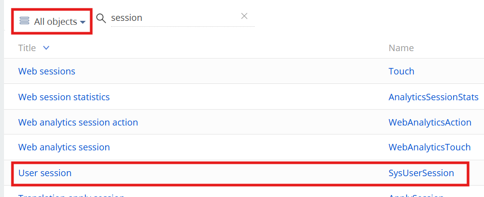
The User Session object is available in Object Permissions, just make sure to use filter by all objects:

Hello,

The User Session object is available in Object Permissions, just make sure to use filter by all objects:

Mira Dmitruk,

Thank you!

Show all comments
FreedomUI
Studio_Creatio
Development
Studio_Creatio_enterprise_edition
8.0

Hello,

Currently working on customizing our portal to have the exact colors for branding guidelines. I noticed that graphs only have a small set of specific colors to pick from, and it does not seem possible to override using MainHeaderSchema  replacing view since it is rendered via a Canvas element. I was wondering if it was possible to go in and actually replace the values of the enums for colors found in ModuleSectionEnums within the CrtWizard7x package. We are also on cloud.

Any information would be super helpful! Thank you!

Like 0

Like

1 comments
formula
DateValue
Business Process
Integer
datetime
Studio_Creatio_enterprise_edition
8.0

I have a business process that needs to calculate the a date for a record's date field. Users input integers to represent Day. I need to use the current date to capture the year, and month  for example. What should the formula look like to return those three values as a date value in a parameter that I can set into a record's field?

This for reference, does not work:

DateTime([#System variable.Current Date#].Year,[#System variable.Current Date#].Month,1)

I get an error: Parameter "DateDateTimeUtilities" not found

Like 0

Like

3 comments
Best reply

So what I did was:

DateTime.Parse(([#System variable.Current Date#].Month).ToString()+"/'+[#User input day of month parameters#].ToString()+"/'+([#System variable.Current Date#].Year).ToString())

Hello.

Please use the following formula:
([#System variable.Current Time and Date#].AddDays(1 - [#System variable.Current Time and Date#].Day)).AddDays([#EnteredParameter#] - 1)

Where #EnteredParameter# is the value provided by the user.

This formula takes the current date, resets it to the first day of the current month, and then adds the number of days based on the entered parameter. As a result, it sets the desired day within the current month, while preserving the current time according to your requirements.

Best regards,
Antonii.

After fooling' around with different functions, DateTime.Parse() actually works for my use case too. withe MM/dd/YYYY format. I am able to use my parameters with the .ToString() to create the date I need.

So what I did was:

DateTime.Parse(([#System variable.Current Date#].Month).ToString()+"/'+[#User input day of month parameters#].ToString()+"/'+([#System variable.Current Date#].Year).ToString())

Show all comments