We've been using a combination of tools at Ent Credit Union to improve the overall look/feel of Creatio modal containers. While the ability to set the modal size from S, M, L, XL is nice... many times, these still feel clunky. We have several workflows in our environment that push users through a modal workflow wizard, with each stage containing differing data and formats. As the user steps through each stage of the wizard, we want to make sure the modal size fits the displayed content.
To accomplish this, we leverage the Marketplace addon Experceo Global JS/CSS Editor for Creatio | Creatio Marketplace alongside some minor CSS overrides to control the behavior on the modal pages.
The result is modal containers that will dynamically adjust in a "range" relative to the selected modal size. This will allow you to benefit from a dynamic and flexible interface, while still being able to enforce a reasonable minimum and maximum for each modal size. Added bonus for ease transition animations, which further helps the fluidity of the UI/UX during window resizes.
Enjoy!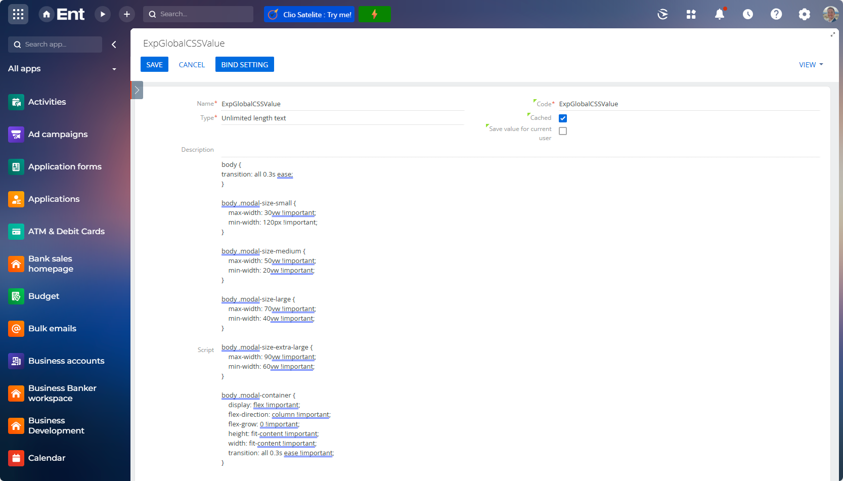
body .modal-size-small {
max-width: 30vw !important;
min-width: 120px !important;
}
body .modal-size-medium {
max-width: 50vw !important;
min-width: 20vw !important;
}
body .modal-size-large {
max-width: 70vw !important;
min-width: 40vw !important;
}
body .modal-size-extra-large {
max-width: 90vw !important;
min-width: 60vw !important;
}
body .modal-container {
display: flex !important;
flex-direction: column !important;
flex-grow: 0 !important;
height: fit-content !important;
width: fit-content !important;
transition: all 0.3s ease !important;
}